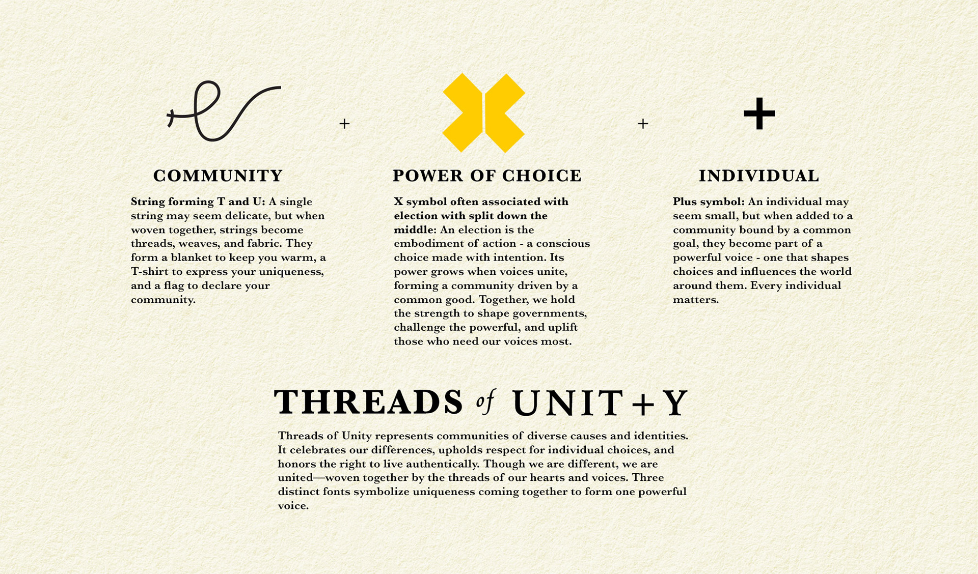
Threads of Unity is a passion project my wife and I created to celebrate love, respect, vibrant energy, and individuality. It reflect that spirit through a brand identity that feels both fearless and joyful, championing community while honouring uniqueness.


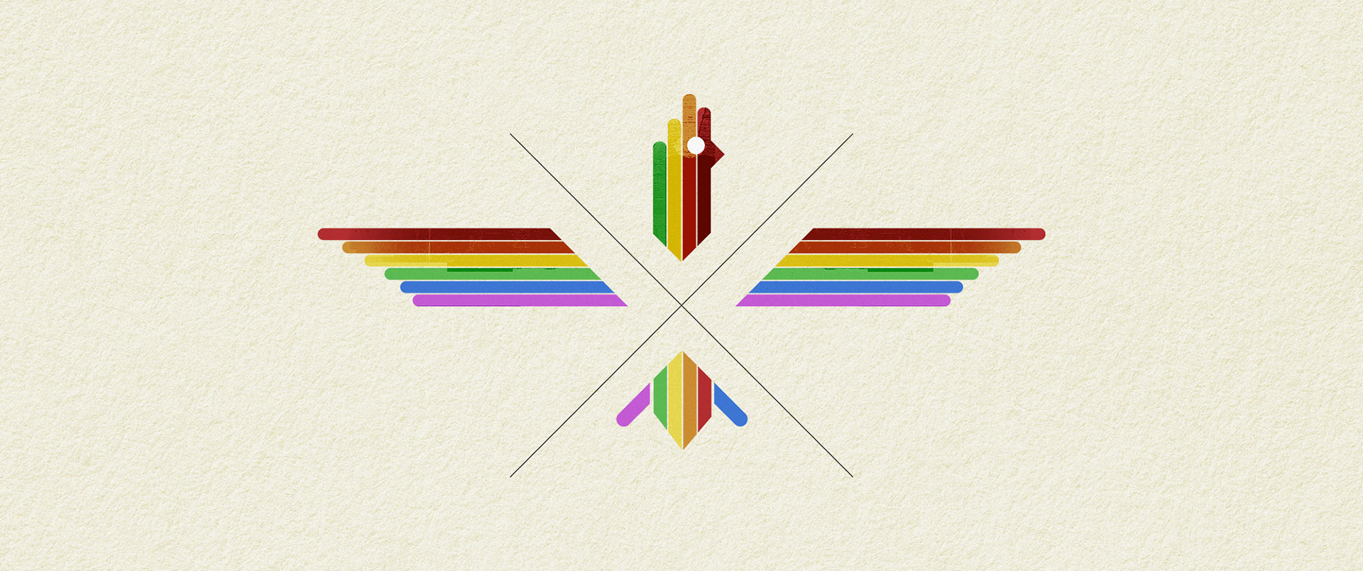
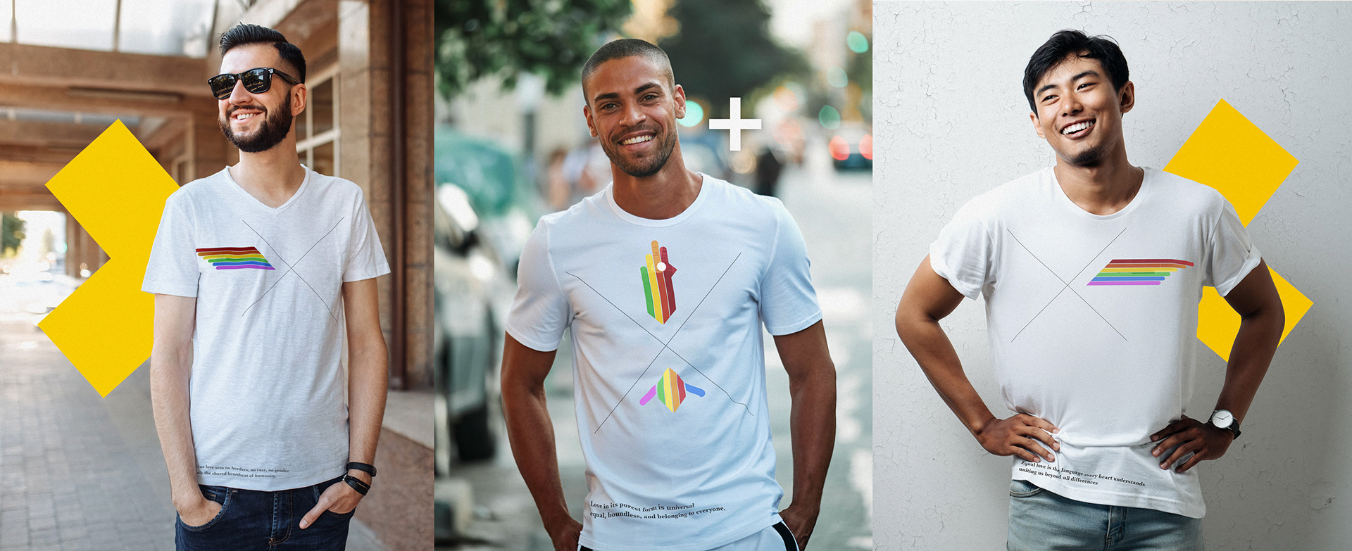
Pride/Love - Apparel concept
A single image representing pride, love and peace is divided into three segments, each printed on a separate T-shirt. When worn, the segments can come together, on the street, on a bus, at a restaurant, sending the message that love and respect belong to everyone.
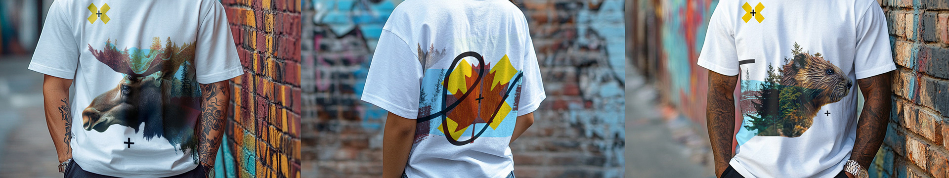
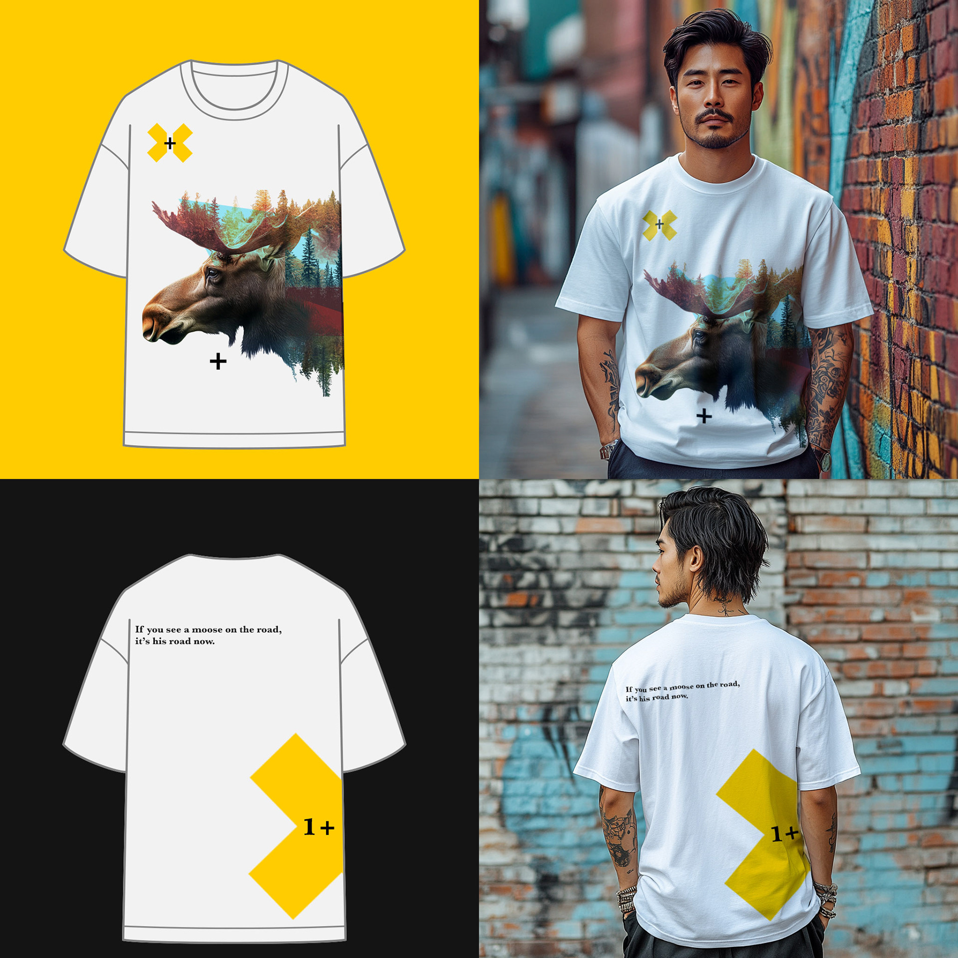
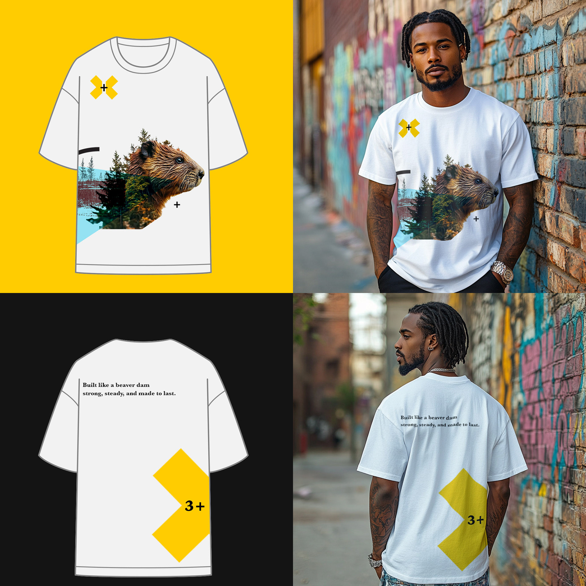
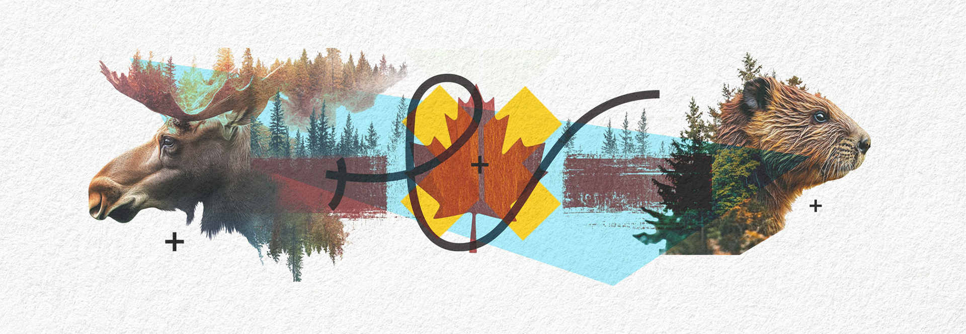
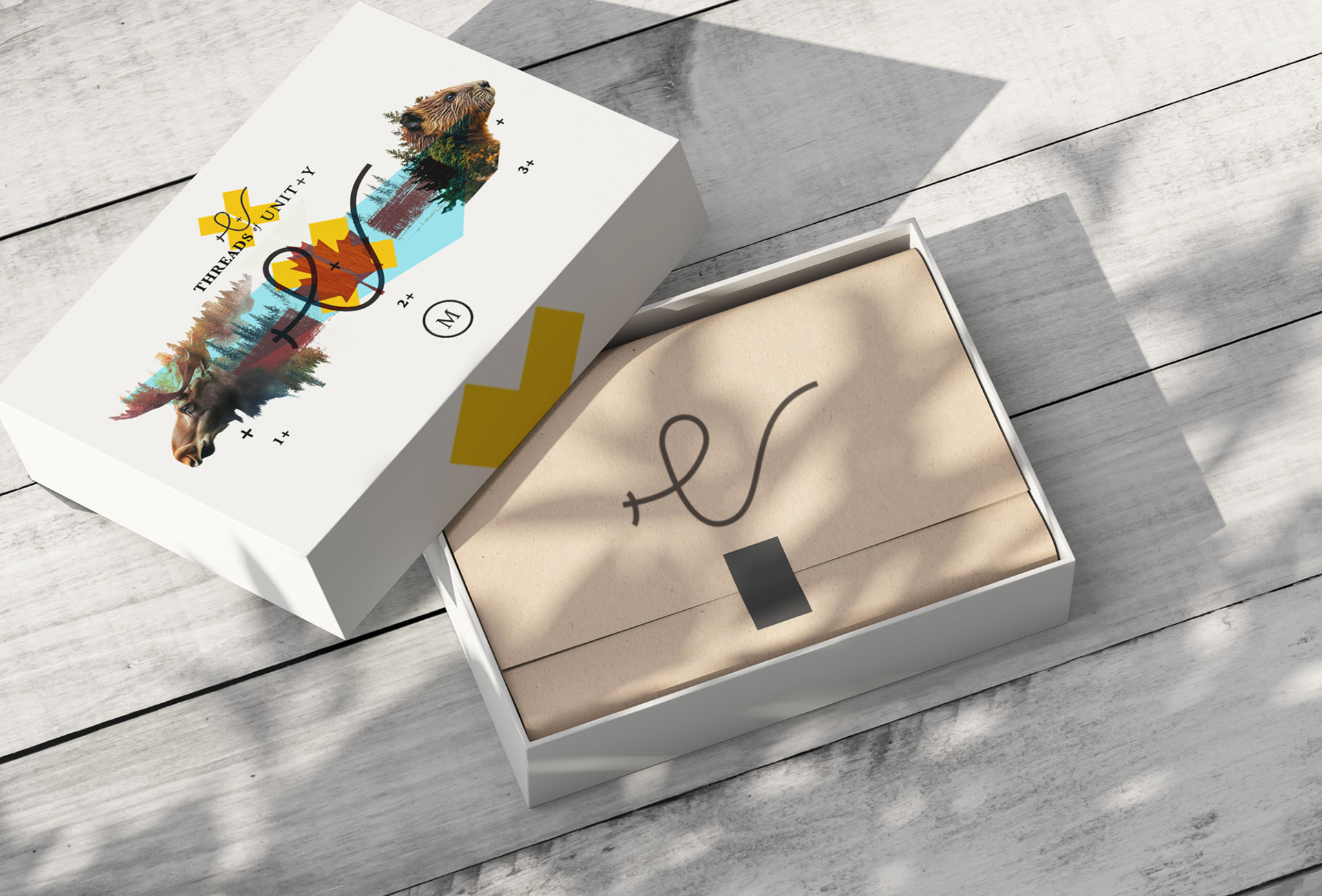
Proud Canadian - Apparel concept
A single image representing Canada and its pride, is divided into three segments. Each segment is printed on a T-shirt, labeled with a number of either 1+, 2+, or 3+. When a customer purchases a T-shirt, the segment they receive remains a surprise until they open the packaging. This adds an element of anticipation to the experience. Even more thrilling is spotting someone on the street with a matching segment, sharing the same pride in being Canadian.
Concept Only: Images of people before T-shirt graphic is added are generated by AI - Midjourney